Saturday, January 24, 2009


Exercise four-Charles Gao
I am going to compare my recently broken IPod which I hate, and my current mp3 player Creative Zen which I love.
.jpg)
I got my iPod as a gift. If not, I would never buy myself an iPod. There are many problems with iPod.
Affordances: iPod uses touching wheel to navigation and control volume. This I particular had problem with. Touching wheel is too sensitive and therefore easy to make mistakes. It constantly creates trouble when I was trying to select song and adjust settings. When I need to change the volume, I constantly cannot select the right volume I wanted to. Lucky enough there is a constraint of maximum volume in setting I can use to limit the maximum volume, otherwise my ear would probably got hurt by the sound already.
From the visibility side, the screen is definitely visible if you only need to listen to music. However, the screen is not big enough to view any sort of image or words which are the functions iPod support. As the result, these functions are useless.
Other problems of iPod are really crucial too. I can’t delete the songs which I don’t like from iPod directly. Every time I try to delete any songs or add any songs, I must go through the iTunes in computer. iTunes really works slowly on PC and gets lots of music store things inside which I never use. If I use another computer other than my own, I cannot edit any of my songs or receives any songs from that computers regardless if that computer gets the iTunes software or not. The fact that iPod uses its own connection cable provides inconvience of the file transportation.
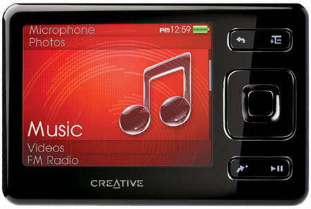
All the problems above with iPod are not connected with my current Creative Zen player. It gets a completely different design than iPod in terms of affordances. Instead of using touching wheel, it uses conventional buttons to navigate and controlling volume. These buttons are designed very well. They are big enough to press, create no trouble when I carry the mp3 player in the pocket, really accurately doing the navigation and volume control and look simple and pretty. The volume control mapped from low volume to high volume by down and up button during the sound playing mode, it is quite easily to work with.
The size of creative Zen is not big, just like the size of banking card, but it gets a big screen and blue light that indicates player is on. Instead of using portrait display form, it uses landscape display. This change increases the visibility of the player dramatically. I can view photos, videos on it clearly. Interesting enough, even though it gets a bigger screen, the battery life of it is long than iPod if only playing music.
The Creative Zen gets more control options than iPod, but they are necessary in my point of view and not hard to work with. Especially I can delete anything I don’t like from it directly. It can be recognized in any PCs as USB storage and I can copy and paste any songs into it to play with or without software. If I don’t need to use it to view videos, I don’t even need to install any software on computer at all.
It is better than iPod in mostly every way and I have no complains about it.
Friday, January 23, 2009


Thursday, January 22, 2009
Exercise 4 - Object You Love, Object You Hate - Joe Lee

By Joe Lee
PlayStation Portable
The PlayStation Portable is one of my favorite gadgets. This was my first handheld gaming console I ever owned.
Affordances: This portable system has many affordances to be talked about. Firstly, this system is not only used to play video games, but it can be one of a kind all purpose multimedia player you can play your favorite tunes, movies, and even browse on the web. Secondly, those functions that I mentioned, those functions will correspond efficiently at ease.
Constraint
Physical Constraint: For the physical constraint: The PlayStation Portable have a basic axes of a directional pads, which consist of up, down, left, and right. These directional pads are easy to used to browse the multimedia section. Another physical constraint is the analog control, which is mainly used for games.
Psychological Constraint: This system has a handful of useful symbols to use especially the convention, the normal playback control can be found in the music and video multimedia. The volume controls are easy to use in order to get the level of volume you want.
Mapping
The PlayStation Portableís mapping is similar as the regular PlayStation controllers except the handheld gaming system has the 4.3î LCD screen, and the buttons configuration is the same. Other additional includes wi-fi on the top left side of the system, the 2.0 USB mini port is on the top side, the batter charger slot is on the bottom left, and the headphone slot is on the bottom right. Therefore the mapping of this handheld gaming system is easy to use.
Visibility
In my opinion, the battery indicator on the PlayStation Portable is the best feature and I am glad to have it because it could really tell me exactly when the battery is low. When the green light is blinking, the batter is running low and for red light imply that the battery is receiving the power when it is charging. And lastly, it can tell me when the system is fully charged if there is no light when the system is turned off.
SanDisk Sansa c150

This mp3 player is very small and light, and it is easy to bring and to travel with it.
However, this mp3 player has major flaws in term of its function. The mapping of the buttons is convenient but the affordance on this player is very annoying. The most annoying part is when you have to look for the specific song you want to listen to, and when you found the wrong song, you have to go back from square one to look all over again (e.g. from the artist names" letter "T" jumped back to letter "A").

This mp3 player has another flaws on their affordance. The most annoying part is the volume control, which have two opposite directions as in increase and decrease the volume which okay but the responding is not very good, This is because when I press the volume, sometimes it is not responding to either increase and decrease the volume even though I press for slightly long time while waiting.
The iPod look-alike circle control has a minor problem, there are too small to press, and I always canít get to press the playback button right at the spot. The buttons is very sensitive especially when I kept it in my pocket, and it can accidentally change to unwanted song by accidentally press the playback button with my body.
Wednesday, January 21, 2009
Exercise 4- Love and Hate by Tarz Sachdeva
An object that I absolutely love is my Earring/Ring Holder. Well I loved it till now because it keeps all my earrings organized so that I don't spend hours looking for a pair when I need one. But now after analyzing it for this assignment I love it for its perfect design aspects too.

The Affordances are evident upon first look. The protruding curled hooks clearly indicate to hang the earrings in order to hold them in safe place. Also the hook has the perfect circumference so that the earring fits in easily and also that it does not fall out.
The Mapping is well thought out so that every pair has its own space. When I take out a pair, the pairs next to it are not bothered at all. So this way i am sure that if i am pulling out an earring, I will only end up with the pair in my hand that I want not other 10 entangled with it. Also the options of the object clearly Visible. There are hooks at the top to hold my earrings and cushioned sections in the bottom to hold my rings. There's nothing to be confused about, therefore it is a success both design and usability aspects.

An object that I hate is my Floor Lamp which is sleek in design and looks but when it comes to interacting with it, it is a complete disaster. It is a touch lamp so one would think that you just need to tap it to turn it on. But as it turns out that after all the Mapping is not so well thought out. In order to turn it on I have to tap it twice and then to change it's light intensity, just tap it once. Well how was I supposed to know that until I actually experimented with it? Above that the touch sensitivity is so low that a slight touch changes the intensity, so I end up spending 5 minutes just to set the light intensity light.
I understand that it is a touch lamp but who says that means that you are allowed to touch anywhere. Instead why not just make it one spot that is clearly Visible and states "TOUCH HERE". This way I would not have to harass the lamp. Also if only there was a switch or knob to change the intensity of light that could serve as a Constraint, then life would be so much easier.

The Affordances are evident upon first look. The
 protruding curled hooks clearly indicate to hang the earrings in order to hold them in safe place. Also the hook has the perfect circumference so that the earring fits in easily and also that it does not fall out.
The Mapping is well thought out so that every pair has its own space. When I take out a pair, the pairs next to it are not bothered at all. So this way i am sure that if i am pulling out an earring, I will only end up with the pair in my hand that I want not other 10 entangled with it. Also the options of the object clearly Visible. There are hooks at the top to hold my earrings and cushioned sections in the bottom to hold my rings. There's nothing to be confused about, therefore it is a success both design and usability aspects.

An object that I hate is my Floor Lamp which is sleek in design and looks but when it comes to interacting with it, it is a complete disaster. It is a touch lamp so one would think that you just need to tap it to turn it on. But as it turns out that after all the Mapping is not so well thought out. In order to turn it on I have to tap it twice and then to change it's light intensity, just tap it once. Well how was I supposed to know that until I actually experimented with it? Above that the touch sensitivity is so low that a slight touch changes the intensity, so I end up spending 5 minutes just to set the light intensity light.
I understand that it is a touch lamp but who says that means that you are allowed to touch anywhere. Instead why not just make it one spot that is clearly Visible and states "TOUCH HERE". This way I would not have to harass the lamp. Also if only there was a switch or knob to change the intensity of light that could serve as a Constraint, then life would be so much easier.
Exercise Four- Nicole
An object I love is my Macbook. Its appearance alone is cool and sleek but I love much more than that. Even though it is a couple of years old I do not have one single complaint about my Macbook.
One of the affordances that is small but I absolutely love is the magnetized charge cord. This kind of cord is very easy to plug and unplug without damage and it is also very easy to use in low light or small spaces as you don't have to fiddle with the cord it just sticks right on. I also like the visibility of the light on the actual cord that shows the status of the computer's energy level.
Another affordance that the Macbook uses really well is the built in mouse. Not only is the mouse responsive and the buttons simple, but the greatest affordance is the ability to scroll with two fingers. The Macbook recognizes when two or more fingers are on the pad and scroll up and down, its simple and it works. (The only problem in my eyes being the ctrl click substitute for a left clicking button which can sometimes get annoying).
The last thing that I love about my Macbook is its mapping out of its interface. Even though PC lovers might argue I think the layout of the Macbook's interface is easy to use and makes sense. The dock at the bottom has everything essential and doesn't clog up the main screen. In fact, the only icon on my computer that is most important is the Macintosh HD icon which is on the desktop and leads to everything with one click. The top right corner displays everything useful such as my internet status, volume, time and power left and is much better to see then the traditional bottom right corner of a PC.

One object I can not stand is my HP F4280 series scanner, copier and printer. I have had it for only a few months when I started my first semester at OCAD, from the first day on it has been nothing but problematic.
The biggest problem with the printer is the way in which the paper is fed through the printer. The physical constraints that hold the paper in place slide too easily so that when the paper is pulled through the printer it gets pushed around and it jams about seventy five percent of the time that I use it.
Another huge problem with the printer is the visibility of the of the "ink indicator" on the top of the printer. While the idea of letting you know how much ink is left in your computer is a great idea the indicator is always wrong. Many times when the printer shows I am low on ink I can print for months before I need to change the cartridge. On the opposite, the printer will say that I have at least half of a cartridge left and then my computer prints out grainy crappy pictures. The worst is that the light in the indicator does not have any physical constraints so it lights up the entire bar but it just slowly fades in colour making it extremely confusing to read and understand.
The last thing is, (and its mostly just a pet peeve of mine) when I put a new cartridge in my printer it prints off a page automatically of strange dots and instructions that tell you to put this sheet in the scanner area to align the cartridges. This annoys me a lot because it takes an incredible amount of ink to print it. It would have been a good idea to put a permanent copy of this sheet along with the printer when sold, and if it gets lost you have the ability to re-print it!

Monday, January 19, 2009
Exercise Five: Make a Music Video, Make a Diagram
In Exercise Five, you will create a music video in iMovie HD, and then make a diagram of the interaction model of the experience. Please read the instructions that follow carefully, as there are many steps and a number of deliverables.
1) Locate the source files for the music video, located in TEMPORARY_STORAGE in a folder called "Exercise Five."
2) Check out the video clips and audio files. You're welcome to use your own video clips and/or audio files if you have any available.
3) Open iMovie HD, and save an iMovie Project to your desktop using a title of your choice.
4) Pick the audio file that you want to make a video for. Import it to iMovie HD by drag-and-dropping the file into the bar at the bottom of the iMovie screen. Note that this automatically changes iMovie from "clips viewer" mode to "timeline viewer" mode. You can also do this with the two buttons near the bottom right of the screen.
5) Pick some video clips that you might want to use to make your video. Drag-and-drop them into the "clips" pane at the right of the iMovie screen. From here, you'll drag-and-drop them into the upper bar in the timeline, once you've decided how you want to use them.
6) Make your video! Play around. There are a lot of features in iMovie HD, but some that you'll want to be sure to learn how to use include:
-the volume control on the audio clip (select the clip, View>Show Clip Volume Levels, fiddle with the audio "line");
-how to cut the audio clip (place the playhead; Edit>Split Audio Clip at Playhead);
-the fact that iMovie measures time in Minutes:Seconds:Frames, and that there are only 30 frames per second;
-the fact that some of the video clips have sound in them already, which you may want to control/eliminate (again, select the clip, View>Show Clip Volume Levels, fiddle with the audio "line"), and
-the editing pane (the button for this is on the bottom right), especially transitions (once in the editing pane, the button for this is on the top right).
7) Keep making your video. Play for about an hour. Learn as much as you can. iMovie is a great tool for making quick videos, and will serve you well for Project One.
8) Remember to save your iMovie project often. iMovie doesn't create a playable file directly - in order to do this, you'll need to perform one last action. Click File>Export, and then select "Web Streaming". This will take a few minutes, and will create a playable Quicktime file, just like the video clips you were given to work with.
9) Upload your finished video to the course blog.
10) Last but not least, make a diagram of the entire interactive experience of creating your video and uploading it to the blog. It would be prudent to take notes throughout the process (it's also always prudent to read all of the instructions before you start a task). Draw the diagram by hand, scan it and post it to the blog in the same post as your video. There's a scanner in the lab, and the monitor can help you if you've never scanned before. Remember to name and label your post appropriately.
Exercise Five is due at 08:30 on Monday, February 8th.
1) Locate the source files for the music video, located in TEMPORARY_STORAGE in a folder called "Exercise Five."
2) Check out the video clips and audio files. You're welcome to use your own video clips and/or audio files if you have any available.
3) Open iMovie HD, and save an iMovie Project to your desktop using a title of your choice.
4) Pick the audio file that you want to make a video for. Import it to iMovie HD by drag-and-dropping the file into the bar at the bottom of the iMovie screen. Note that this automatically changes iMovie from "clips viewer" mode to "timeline viewer" mode. You can also do this with the two buttons near the bottom right of the screen.
5) Pick some video clips that you might want to use to make your video. Drag-and-drop them into the "clips" pane at the right of the iMovie screen. From here, you'll drag-and-drop them into the upper bar in the timeline, once you've decided how you want to use them.
6) Make your video! Play around. There are a lot of features in iMovie HD, but some that you'll want to be sure to learn how to use include:
-the volume control on the audio clip (select the clip, View>Show Clip Volume Levels, fiddle with the audio "line");
-how to cut the audio clip (place the playhead; Edit>Split Audio Clip at Playhead);
-the fact that iMovie measures time in Minutes:Seconds:Frames, and that there are only 30 frames per second;
-the fact that some of the video clips have sound in them already, which you may want to control/eliminate (again, select the clip, View>Show Clip Volume Levels, fiddle with the audio "line"), and
-the editing pane (the button for this is on the bottom right), especially transitions (once in the editing pane, the button for this is on the top right).
7) Keep making your video. Play for about an hour. Learn as much as you can. iMovie is a great tool for making quick videos, and will serve you well for Project One.
8) Remember to save your iMovie project often. iMovie doesn't create a playable file directly - in order to do this, you'll need to perform one last action. Click File>Export, and then select "Web Streaming". This will take a few minutes, and will create a playable Quicktime file, just like the video clips you were given to work with.
9) Upload your finished video to the course blog.
10) Last but not least, make a diagram of the entire interactive experience of creating your video and uploading it to the blog. It would be prudent to take notes throughout the process (it's also always prudent to read all of the instructions before you start a task). Draw the diagram by hand, scan it and post it to the blog in the same post as your video. There's a scanner in the lab, and the monitor can help you if you've never scanned before. Remember to name and label your post appropriately.
Exercise Five is due at 08:30 on Monday, February 8th.
Exercise Four Example: Jesse Colin Jackson
 An object I love is the STAEDTLER Mars technico 780 C lead holder. I have 4 of them. One I've had since 1996, and the rest I've acquired later. In each I keep a different weight of lead: 6H, 4H, 2H and HB.
Affordances are subtle yet clear. The knurled end gives a tactile indication of where to best hold the lead holder; the clip keeps it secure in my pocket protector (ha, ha). As we expect, the end serves as a push-button to advance the lead. More unusually, it also serves as a sharpener, a possibility subtly suggested by its size (the same as the lead) and clarified by a diagram on the Staedtler website.
 When the end is depressed, the lead advances. One potentially problematic aspect of the design is that unlike most lead holders, the lead does not advance incrementally. Instead, the push-button opens the jaws at the end that grip the lead, allowing the lead to potentially fall out of the pencil (an expensive error, at 2 bucks a lead). Once learned, it becomes natural to guard against this with your other hand when advancing a lead, and the infinite adjustability allows the lead to be sharpened to both a sharp and rounded tip, but perhaps a physical constraint could be introduced that prevents the lead from falling out completely.
There's no way to automatically differentiate between the different weights of lead, as the only available colour is blue. I've added an ugly label made of masking tape to each, which provides crude visible feedback, but it's an ugly solution at best.
[Disclaimer: I'll concede that I don't actually use a lead-holder much anymore. So perhaps there's some wistful nostalgia in my praise.]
 An object I hate is my Sony Ericsson W810i mobile phone. It seems clever, at first: I'm impressed with the fact that the camera elements are mapped to a conventional camera. To operate the camera, you turn the phone sideways, which places the shutter button exactly where you expect it to be. By taking advantage of my existing camera interaction model,
 Sony has made it easier to take pictures. . . if I could figure out how to turn the camera on. There are no physical constraints to keep me from pressing the buttons when the phone is in my pocket, and these affordances are way too small in the first place: I'm forever turning the walkman on when I want to answer a call, as the buttons for these functions are right beside each other.
The audible feedback is excruciating: why can't mobile phones come with a normal ring tone? Why does my phone have to sound like a cat? I know, I know, I can download new ring tones - perhaps one of you can show me how.
Exercise Four: An Object you Love, an Object you Hate
In your home, find two functional objects: one that you love, and one that you hate.
Make a brief post to the blog where you describe your love/hate relationships, using the tools and vocabulary introduced in the Basic Principles of Experience Design presentation. Before you post, download and review the following terms in Universal Principles of Design: Affordance, Constraint, Mapping and Visibility.
Be sure to include photographs of your objects in your post. Make sure the photographs adequately represent the source of your love/hate relationship.
Exercise Four is due at 08:30 on Monday, January 26.
Make a brief post to the blog where you describe your love/hate relationships, using the tools and vocabulary introduced in the Basic Principles of Experience Design presentation. Before you post, download and review the following terms in Universal Principles of Design: Affordance, Constraint, Mapping and Visibility.
Be sure to include photographs of your objects in your post. Make sure the photographs adequately represent the source of your love/hate relationship.
Exercise Four is due at 08:30 on Monday, January 26.
Reference Material: Basic Principles Presentation
Click here to download the Basic Principles of Experience Design presentation.
Reference Material: Information Visualization 201-240
Click here to download Information Visualization 201-240.
---
"The Brain is a powerful pattern-finding engine; indeed, this is the fundamental reason that visualization techniques are becoming important. Ther is no other way of presenting information so that structures, groups and trens can be discovered among hundreds of data values. If we can transform data into the appropriate visual representation, its structure may be revealed." (Ware 239)
---
"The Brain is a powerful pattern-finding engine; indeed, this is the fundamental reason that visualization techniques are becoming important. Ther is no other way of presenting information so that structures, groups and trens can be discovered among hundreds of data values. If we can transform data into the appropriate visual representation, its structure may be revealed." (Ware 239)
Reference Material: Envisioning Information 12-35
Click here to download Envisioning Information 12-35.
---
"Even though we navigate daily through a perceptual world of three spatial dimensions and reason occasionally about higher dimensional arenas with mathematical ease, the world portrayed on our information displays is caught up in the two-dimensionality of the endless flatland of paper and video screen. . . . Escaping this flatland is the essential task of envisioning information - for all the interesting worlds (physical, biological, imaginary, human) that we seek to understand are inevitably and happily multivariate in nature. Not flatlands." (Tufte 12)
---
"Even though we navigate daily through a perceptual world of three spatial dimensions and reason occasionally about higher dimensional arenas with mathematical ease, the world portrayed on our information displays is caught up in the two-dimensionality of the endless flatland of paper and video screen. . . . Escaping this flatland is the essential task of envisioning information - for all the interesting worlds (physical, biological, imaginary, human) that we seek to understand are inevitably and happily multivariate in nature. Not flatlands." (Tufte 12)
Sunday, January 18, 2009
Exercise One - Name
 Joshua Fréchette
Graphic Design
This is my first year using Photoshop and Illustrator, it's been a bit frustrating, but I'm getting better at using them
Exercise 3 - Strategies for Conveying Information
Exercise 3 - Strategies for Conveying Information
By Joe, Alan, Jay, Giustina
COMMON FATE

The principle of common fate is referred as Gestalt principles of perception. It asserts that elements that move together in a common direction are perceived as a single group, and interpreted as being more related that elements that move at different times or in different directions. If a certain element moves in one direction, and the other elements move in the opposite direction, both elements are grouped by common motion and direction.
INTERFERENCE EFFECTS
The interference effects occur when two or more understanding or the memory processes are in conflict. Human understanding and memory from the brain involved different mental systems to analyze and to process information. When the output is corresponding, the process of interpretation occur quickly, and the performance is at the best. If the output does not correspond, the interference effects occur and extra processing is require to resolve the problem. Additional time is also required to resolve the conflict that have the negative impact to the performance.

Stroop Interference: An irrelevant process aspect of information triggers a mental process that interfere with the processes involving a relevant aspect of the information.
Example: It takes more time to name the color when the meaning and the color words conflict.
ORIENTATION SENSITIVITY
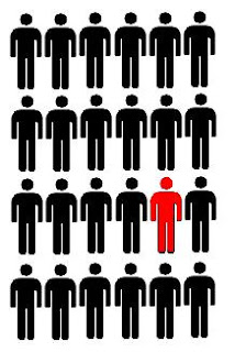
An orientation sensitivity can be effective if the people can perceive and make judgments about the orientation of lines if it influenced by "oblique" effect and "pop-out" effect. The pop-out effect is the tendency of of the certain element in the display to pop out as the emphasis of the element, which resulted to be quickly and easily to be detected. The oblique effect is the ability to more accurately perceive and judge the line orientation that are close to vertical and horizontal, that line orientations are oblique.
By Joe, Alan, Jay, Giustina
COMMON FATE

The principle of common fate is referred as Gestalt principles of perception. It asserts that elements that move together in a common direction are perceived as a single group, and interpreted as being more related that elements that move at different times or in different directions. If a certain element moves in one direction, and the other elements move in the opposite direction, both elements are grouped by common motion and direction.
INTERFERENCE EFFECTS
The interference effects occur when two or more understanding or the memory processes are in conflict. Human understanding and memory from the brain involved different mental systems to analyze and to process information. When the output is corresponding, the process of interpretation occur quickly, and the performance is at the best. If the output does not correspond, the interference effects occur and extra processing is require to resolve the problem. Additional time is also required to resolve the conflict that have the negative impact to the performance.

Stroop Interference: An irrelevant process aspect of information triggers a mental process that interfere with the processes involving a relevant aspect of the information.
Example: It takes more time to name the color when the meaning and the color words conflict.
ORIENTATION SENSITIVITY

An orientation sensitivity can be effective if the people can perceive and make judgments about the orientation of lines if it influenced by "oblique" effect and "pop-out" effect. The pop-out effect is the tendency of of the certain element in the display to pop out as the emphasis of the element, which resulted to be quickly and easily to be detected. The oblique effect is the ability to more accurately perceive and judge the line orientation that are close to vertical and horizontal, that line orientations are oblique.
Exercise Three: Desiree, Brad, Josh
Closure
People tend to identify a set of individual elements as a single recognizable pattern rather than multiple elements. This inclination makes people close gaps and fill in missing information. The tendency to perceive information in this fashion is a natural reaction and is a subconscious habit. Closure is strongest when elements are simple, recognizable patterns. Also, subtle visual cues can help direct the eye to find the pattern. This tendency helps designers to reduce complexity by using a smaller number of elements to organize and communicate information.
 In this logo, some information is removed but our eye still follows the lines.
Good Continuation
Aligned elements are perceived as single groups or chunks. They are interpreted as more related than unaligned elements.The ability to accurately recognize objects depends on perceptibility of corners and sharp curves that make up their shape. If a designer chooses to have sections of a line or shape hidden from view, good continuation will still lead the eye to continue along visible segments. As the angle of disruption becomes more heightened, the elements will seem less related to each other.
 This image of a ruler has good continuation, we can continue the patter the lines make beyond the picture frame.
Uniform Connectedness
Elements connected to one another by uniform visual properties are seen as a single group or chunk. They are interpreted as being more related than elements that are not connected. There are two basic strategies for applying uniform connectedness in a design:
- Common Regions- regions formed when edges come together and bound visual area grouping elements within the region
- Connecting lines- formed when explicit line joins elements, grouping connected elements
This technique will generally overpower the other principles. Elements that uniformly connect will appear more related.
 The buttons on this controller are grouped together depending on their function.
By: Desiree, Brad and Josh.
Exercise 3- Gestault's Universal Principles of Design
Exercise 3
By: Cathy, Humyra, Tarz & Lindsay
1.) ALIGNMENT:
Alignment is defined as the arrangement/placement of an object in linear fashion (horizontally or vertically) or along a common center in relation to another object. Alignment is essential in a design to create a sense of unity and cohesion that contributes to the overall pleasing aesthetics of the design. It can be a very strong factor in understanding of the design. Generally alignment is discussed in linear fashion but there are also diagonal, spiral and circular alignments that depend on angles and central points.Even with all such principles, there also some exceptions; for example a chaotic design to create tension or a focal point to attract attention. However, these exceptions are occasional and should be avo
 ided to keep alignment as a major principle of
design.

Spikes of a wheel are aligned in a circular manner to maintain the uniformity in the wheel's working.
2.) HIGHLIGHTING:
Highlighting is an effective technique for bringing attention to elements of design. However, if it is applied improperly, it can be ineffective and lose the performance in these areas. The guidelines address the benefits and liabilities of the common highlighting techniques. Techniques that are used in highlighting are the following: general, bold, italics and understanding, typeface, color, inversing and blinking. Example of using highlighting is to improve the face features of the model’s face.
3.)LAYERING:
Layering is a way of organizing information by putting them into related groups. It is used to ‘manage complexity, but can also be used to reinforce relationships in information.’
There are two kinds of layering
1) Two-dimensional:
divide information into layers so that only one layer of information can be viewed at a time. It can be presented in linear or nonlinear style.
2) Three-dimensional:
divides information in a way so that multiple layers of information can be viewed at one time. These layers are presented ‘in either opaque or transparent planes of information that sit atop one another.
EXAMPLES:
 Three Dimensional Layering:(Opaque)
4.) SIGNAL-TO-NOISE RATIO:
Signal-to-noise ratio is described as the ratio of relevant and irrelevant information in a piece of work. Signal is identified as the information that is being conveyed and noise is identified as the irrelevant information that distracts the viewer from the real meaning. In an ideal design the aim should be to achieve a high signal-to-noise ratio, suggesting that the information provided is efficient and is presented in a concise and simple manner. This can be achieved by maximizing signal and minimizing noise. Maximizing signal involves clearly communicating the idea with the minimal use of elaborative elements. Thorough research and careful decision-making is essential for that. Minimizing noise involves removing all the unnecessary elements. To maximize the signal-to-noise ratio consider simple design strategies and avoid unnecessary expression of elements.
In the example listed below, the two brochures are for the same campaign.

Low signal-to-noise ratio (graphics distracting)
 High signal-to-noise ratio(simple and clear)

Subscribe to:
Posts (Atom)